


TL;DR: Organizations track 95% on-time delivery rates using aggregate transit data while 20-40% of customers experience systematic delays. Geographic segmentation reveals which customer segments receive late shipments, which routes underperform, and where carrier selection creates hidden retention risks. Connected data infrastructure transforms coordination-prohibitive analysis into continuous operational intelligence.
Organizations track aggregate transit times showing 95% on-time delivery. Carrier performance looks solid. Contracts get renewed based on these numbers.
Then customer complaints surface. Florida customers report consistent delays. California accounts threaten to leave. The aggregate data showed everything was fine.
The problem is aggregation. When transit times collapse into network-wide averages, geographic granularity disappears. The data showing which customer segments experience systematic delays gets destroyed.
Analysis across shipping operations at scale reveals a consistent pattern. Aggregate metrics mask route-level failures affecting 20-40% of the customer base. Organizations optimizing for network-wide performance systematically underdeliver to specific geographies while remaining blind to the pattern.
Why Geographic Segmentation Reveals What Aggregates Hide
Aggregate transit time data tells you the forest looks healthy. Geographic segmentation shows you which trees are dying.
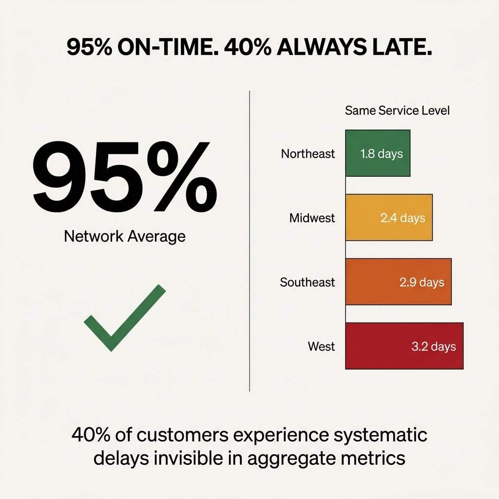
At scale, shipping 100,000 packages weekly across the country produces carrier reports showing 2.3 days average transit time for 2-Day service. Performance looks acceptable.
Segmentation by customer ZIP code reveals different patterns. Northeast customers receive shipments in 1.8 days. Southeast customers wait 2.9 days. West Coast customers experience 3.2 days. All using the same service level.
The aggregate shows 2.3 days (acceptable performance). The geographic view shows 40% of customers receiving systematically late deliveries (unacceptable performance hidden by averaging).
Core Pattern: Volume multiplication at scale means route-level inefficiencies compound into massive customer experience gaps invisible in aggregate metrics.
Where Carrier Selection Goes Wrong
Organizations select carriers based on aggregate cost per package or network-wide transit performance. This decision logic systematically misallocates shipping volume.
Carrier A performs optimally in Northeast corridors. Strong infrastructure, consistent delivery windows, minimal delays. Carrier A underperforms in Southeast zones. Weaker coverage, longer transit times, higher exception rates.
Carrier B shows the inverse pattern (Southeast strength, Northeast weakness).
Aggregate data analysis shows both carriers looking equivalent. Similar average costs, similar average transit times. Volume gets distributed evenly or selected based on minor cost differences.
Geographic decomposition reveals optimization opportunities. Organizations analyzing historical data by route identify the most efficient carriers for specific lanes, producing 15% cost reductions and 20% delivery time improvements.
Carrier A should handle 80% of Northeast volume. Carrier B should handle 80% of Southeast volume. Geographic matching transforms equivalent aggregate performance into route-optimized execution.
The opportunity scales. At 100,000 weekly shipments, proper geographic allocation saves 15-20% on transportation costs ($15,000 to $30,000 weekly for organizations spending $150,000 on shipping).
Allocation Pattern: Carriers excel in specific geographies based on infrastructure density and operational focus, but aggregate metrics prevent recognition of these performance patterns.
How Volume Thresholds Amplify Geographic Problems
At 1,000 weekly shipments, one underperforming route represents manageable impact. You have a few delayed deliveries. Customers complain occasionally. Operations handles it manually.
At 10,000 weekly shipments, geographic concentration effects start multiplying. When 30% of the customer base concentrates in three metros experiencing 1.5-day transit delays, 3,000 systematically late deliveries occur weekly.
At 100,000 weekly shipments, the same pattern affects 30,000 deliveries. Aggregate metrics still show 92% on-time performance (acceptable by industry standards).
But 30% of customers receive systematically late shipments. This is a customer retention threat hidden by aggregation.
The inflection point hits around 10,000 weekly shipments. Below that threshold, manual intervention masks route-level inefficiencies. Above that threshold, volume multiplication transforms isolated problems into systematic failures.
Scale Dynamics: Geographic inefficiencies scale linearly with shipment volume but remain invisible in aggregate metrics until customer concentration creates statistically significant complaint patterns.
What Data Disconnection Costs You
Geographic transit analysis requires connecting three data streams. Shipment origins from your warehouse management system. Customer ZIP codes from your order management platform. Actual delivery dates from carrier tracking feeds.
Most organizations possess all three data streams. But shipping data lives scattered across systems, making basic questions about carrier performance nearly impossible to answer without manual assembly.
The coordination task looks simple. Export shipment data. Download tracking updates. Match records by tracking number. Segment by destination ZIP code. Calculate average transit times by geography.
At 1,000 shipments weekly, this takes an afternoon. At 10,000 shipments, three days plus error rates from manual matching. At 100,000 shipments, structurally impossible without automated infrastructure.
Organizations continue making carrier decisions based on aggregate data. Contracts get renewed showing acceptable network-wide performance. The 15-20% optimization opportunity hiding in geographic segmentation gets missed.
The cost exceeds transportation spend. Customer experience degrades without detection until complaint volume forces attention.
Coordination Bottleneck: Data connectivity requirements for geographic analysis appear simple but become coordination bottlenecks at scale, preventing optimization despite data availability.
Why Regional Carriers Outperform Nationals in Specific Lanes
National carriers optimize for network breadth. Regional carriers optimize for lane density.
The pattern repeats across operations. Organizations shipping between LA and Northern California discover regional carriers offer faster transit times and lower costs than UPS or FedEx for that specific corridor.
The same applies to Northeast corridors. Vegas to California routes. Any lane where regional carriers built infrastructure density exceeding national carrier investment.
Aggregate data prevents identifying these opportunities. National carriers show acceptable average performance across all routes. Regional carriers do not appear in analysis because geographic segmentation is absent.
Geographic decomposition reveals lanes where regional alternatives deliver better service at lower cost. Network optimization selects the right carriers for specific routes based on service quality, geographic reach, and pricing.
The strategic implication is carrier mixing. National carriers for broad coverage. Regional specialists for high-volume lanes where they outperform.
This optimization requires route-level visibility impossible with aggregate metrics.
Specialization Edge: Regional carriers concentrate infrastructure investment in specific geographies, creating performance advantages invisible when comparing network-wide averages against national carriers.
How Distribution Center Location Compounds Geographic Effects
Multi-DC operations amplify geographic transit complexity. Each distribution center serves different customer concentrations. Each faces different carrier performance patterns.
Network-level transit time analysis misses DC-specific dynamics. The East Coast facility might experience excellent carrier performance while the West Coast facility systematically underdelivers.
Aggregate data shows acceptable average performance. DC-level segmentation reveals one facility operates efficiently while another bleeds customer satisfaction.
The same pattern applies to product mix. Certain DCs handle different SKU profiles. Heavy items ship differently than light packages. Fragile goods require different carriers than durable products.
Geographic analysis by DC and product category reveals optimization opportunities impossible to detect in aggregate views. Specific facilities should use different carrier mixes. Specific product lines perform better with alternative service levels.
Organizations optimizing at the macro level make systematically wrong decisions about DC operations and product routing.
Operational Layers: Distribution center proliferation multiplies geographic variables requiring segmented analysis, but aggregate metrics collapse this complexity into misleading averages.
What Connected Data Infrastructure Actually Unlocks
Geographic transit analysis isn't a separate optimization problem. It's the first application of connected shipping data infrastructure.
Solving data connectivity for transit analysis simultaneously unlocks cost analysis by zone, customer segment performance decomposition, and seasonal pattern detection by route.
The same infrastructure enabling geographic segmentation enables operational auditing. Detection occurs when packaging changes at a specific DC create dimensional weight charges. Identification happens when service level upgrades occur without re-rating. Consolidation decisions made without optimization get caught.
Network optimization becomes accessible. Existing volume gets re-rated against alternative carriers by lane. Carrier mixing strategies get modeled. Rate change impacts get scenario tested before they materialize.
These are downstream applications of the same data connectivity solving the geographic transit problem.
Organizations treating transit analysis as isolated tactical concern miss this pattern. The industry sells these as independent services because the market evolved that way. Parcel audit was one vendor. Network consulting was another. Transit analysis was a spreadsheet exercise.
All require the same foundational data layer. Connected shipment records. Linked tracking events. Associated cost data. Customer location mapping.
Infrastructure Multiplier: Data connectivity built for one optimization simultaneously enables multiple analysis dimensions because all share identical foundational requirements for connected, complete, real-time data streams.
Why This Requires Infrastructure, Not Tools
The shipping analytics market offers dashboards showing aggregate metrics. Beautiful visualizations. Executive reporting packages.
These tools do not solve the underlying problem. They display data already possessed in more attractive formats.
Geographic segmentation requires data connectivity infrastructure. Automated matching of shipment records to tracking events to customer locations. Continuous updates as new deliveries complete. Historical pattern storage enabling trend analysis.
This is a data engineering problem.
Organizations attempting geographic analysis with existing tools discover the coordination bottleneck immediately. Manual exports. Spreadsheet matching. Weekly refresh cycles that age data before analysis completes.
At 10,000+ weekly shipments, manual coordination fails structurally. The time required to assemble data exceeds the decision window requiring the analysis.
Infrastructure investment solves this by automating the assembly layer. Data streams connect continuously. Geographic segmentation updates in real time. Analysis becomes accessible on demand rather than requiring week-long assembly projects.
The strategic choice is between infrastructure that scales with volume or accepting that optimization opportunities remain permanently inaccessible due to coordination costs.
Architecture Necessity: Geographic analysis at scale requires automated data connectivity infrastructure because coordination complexity exceeds manual assembly capacity above volume thresholds.
Where Operations Bleeds Money Invisibly
Geographic transit analysis reveals operational inefficiencies hiding in aggregate metrics.
Packaging changes at a specific DC create unexpected dimensional weight charges. Nobody notices because aggregate cost per package looks acceptable.
Service level upgrades occur at the dock when shipments run behind schedule. Operations accelerates delivery to meet promise dates. Costs overrun rate shopping predictions. Aggregate metrics do not flag the pattern because a small percentage of total volume gets affected.
Consolidation decisions get made without re-rating. Two orders going to the same customer get bulk packed into one box. Packaging materials get saved. But the shipment gets rated at the original service level optimized for two smaller packages (not one larger box). The cost increase exceeds packaging savings.
These operational bleeds occur at fractions of 1% of total volume. Invisible in aggregate data. Material at scale.
At 100,000 weekly shipments, a 0.5% operational inefficiency represents 500 shipments weekly. At $5 more per shipment than optimized routing, the cost is $2,500 weekly or $130,000 annually.
Geographic segmentation combined with operational context reveals these patterns. Cost anomalies by DC, by time period, by product category become visible. They trace to specific operational changes requiring correction.
Visibility Gap: Small-percentage inefficiencies invisible in aggregate metrics become materially significant at scale, but detection requires geographic and operational segmentation impossible with disconnected data.
How Customer Experience Degrades Without Detection
Research shows 73% of shoppers expect fast and affordable shipping. But aggregate transit metrics systematically conceal which customer segments experience delays.
Organizations tracking network-wide averages discover delivery problems only after customer complaints surface. By then, the pattern has persisted for months.
Geographic segmentation provides early warning. Transit time degradation in specific zones gets detected before complaint volume forces attention.
High-value customer concentrations correlating with worst-performing routes get identified. Enterprise accounts concentrate in metros experiencing systematic delays. Aggregate data showed acceptable performance. Geographic analysis reveals systematic underdelivery to the most important customers.
The customer experience gap compounds over time. One late delivery gets forgiven. Systematic lateness drives account reviews and vendor evaluations.
Prevention requires visibility before complaint patterns emerge. Continuous geographic monitoring (not quarterly aggregate reviews).
Detection Threshold: Customer satisfaction degradation occurs at the segment level but remains invisible in aggregate metrics until complaint volume reaches detection thresholds, making proactive correction impossible.
What the Data Actually Shows
I've analyzed shipping operations across dozens of organizations. The pattern is consistent.
Organizations using aggregate metrics for carrier selection systematically misallocate 15-20% of shipping volume. Shipments get distributed based on network-wide performance while route-specific optimization opportunities get missed.
Organizations tracking only aggregate transit times discover customer experience problems months after they begin. Geographic segmentation provides early warning at the point where correction prevents retention impact.
Organizations attempting geographic analysis with disconnected data abandon the effort after discovering coordination costs exceed analysis value. Infrastructure investment transforms this economics by amortizing assembly costs across continuous analysis.
The optimization gap is data connectivity enabling systematic exploitation of geographic knowledge at scale.
Without connected infrastructure, geographic analysis remains a quarterly project requiring manual assembly. With infrastructure, it becomes continuous operational intelligence informing daily carrier selection and network optimization decisions.
Observed Pattern: Organizations possessing geographic performance data but lacking connectivity infrastructure systematically abandon optimization opportunities due to coordination costs exceeding per-analysis value despite aggregate opportunity materiality.
Why This Matters Now
Shipping volumes continue growing. Customer expectations for delivery speed continue rising. Carrier pricing continues increasing.
The combination amplifies the cost of optimization gaps. Every misallocated shipment costs more. Every customer experiencing systematic delays represents higher retention risk. Every quarter operating without geographic visibility compounds missed savings.
Organizations continuing to optimize based on aggregate metrics face increasing competitive disadvantage against operations using granular geographic intelligence.
The infrastructure investment required to enable geographic analysis is small relative to transportation spend. But the coordination required to build manually at scale exceeds most organizations' operational capacity.
The strategic question is whether infrastructure gets built that scales with volume or permanent optimization gaps get accepted as operational exhaust.
Aggregate transit data shows acceptable performance. Geographic segmentation would reveal which customers are experiencing systematic failures. The difference between those two views is connected data infrastructure.
Frequently Asked Questions
What is geographic transit time segmentation?
Geographic transit time segmentation breaks down aggregate shipping data by customer location (ZIP code, metro area, or region) to reveal route-specific performance patterns. Instead of seeing network-wide averages, organizations identify which customer segments experience faster or slower deliveries based on their geographic location.
At what shipment volume does geographic analysis become necessary?
The inflection point occurs around 10,000 weekly shipments. Below this threshold, manual intervention masks route-level inefficiencies. Above this threshold, volume multiplication transforms isolated problems into systematic failures affecting thousands of deliveries. At 100,000+ weekly shipments, geographic segmentation becomes essential for preventing material customer experience degradation.
How do organizations connect shipping data for geographic analysis?
Geographic analysis requires connecting three data streams: shipment origins from warehouse management systems, customer ZIP codes from order management platforms, and actual delivery dates from carrier tracking feeds. At scale, this requires automated data connectivity infrastructure rather than manual exports and spreadsheet matching.
Why do aggregate metrics hide carrier performance problems?
Aggregation destroys geographic granularity by averaging performance across all routes. A carrier showing 2.3 days average transit time might deliver in 1.8 days to Northeast customers but 3.2 days to West Coast customers. The aggregate shows acceptable performance while 40% of customers experience systematic delays.
What cost savings does geographic carrier optimization produce?
Organizations analyzing historical data by route and matching carriers to their strongest geographies typically achieve 15-20% transportation cost reductions. At 100,000 weekly shipments with $150,000 weekly spend, proper geographic allocation saves $15,000 to $30,000 weekly.
How do regional carriers compare to national carriers on specific routes?
Regional carriers optimize for lane density rather than network breadth. On routes where regional carriers built infrastructure density exceeding national carrier investment (LA to Northern California, Northeast corridors, Vegas to California), they often deliver faster transit times at lower costs. Geographic decomposition reveals these opportunities invisible in aggregate comparisons.
Why does manual geographic analysis fail at scale?
At 1,000 shipments weekly, manual data assembly takes an afternoon. At 10,000 shipments, three days plus error rates from manual matching. At 100,000 shipments, the time required to assemble data exceeds the decision window requiring the analysis. Manual coordination fails structurally above volume thresholds.
What other optimizations does connected shipping data enable?
Data connectivity built for transit analysis simultaneously enables cost analysis by zone, customer segment performance decomposition, seasonal pattern detection, operational auditing (dimensional weight charge detection, service level upgrade identification), network optimization modeling, and rate change scenario testing. All share identical foundational requirements for connected, complete, real-time data streams.
Key Takeaways
- Aggregate transit metrics hide route-level failures affecting 20-40% of customer base by destroying geographic granularity through network-wide averaging
- Geographic segmentation reveals carrier performance patterns by route, enabling 15-20% cost reductions through proper carrier-to-geography matching
- Volume threshold around 10,000 weekly shipments creates inflection point where manual coordination fails and geographic inefficiencies multiply into systematic customer experience problems
- Connected data infrastructure transforms coordination-prohibitive quarterly analysis into continuous operational intelligence informing daily decisions
- Organizations using aggregate metrics for carrier selection systematically misallocate 15-20% of shipping volume while missing optimization opportunities visible through geographic decomposition
- Data connectivity built for geographic analysis simultaneously enables multiple downstream optimizations (cost analysis, operational auditing, network modeling) sharing identical foundational requirements
- Prevention of customer experience degradation requires continuous geographic monitoring before complaint patterns emerge rather than reactive aggregate reviews after retention impact occurs
What patterns are hiding in your shipping data that aggregate metrics prevent you from seeing?


